If the objective is to get the maximum 'visual' difference for two hashes, why not re-hash both of them first? That results in any small changes causing a huge difference in the final outputs.
If the hash is doing its job, two similar inputs should already yield completely different hashes and therefore different visuals.
Each visual is a representation of a single hash. If it was designed to compare two hashes, it could simply show a true/false status because the only purpose is to see if they match.
Yes, that's correct, but if you get similar visualization for similar hashes, then you've got a much larger target to hit in your search space if you're trying to produce a value whose hash has a visualization that's close enough to pass manual inspection, which would circumvent the purpose of this hash visualization.
> if you get similar visualization for similar hashes
True if you did, but I don't think that's the case. Even a single bit difference would send the bishop in a different direction and therefore cause a major difference in the count of squares visited.
I did a quick test to verify this on OP's site. Just incrementing a sample hash by 1 does substantially change the visual.
It's possible two completely different hashes show similar visuals, but I don't think two similar hashes normally do. Hence no reason to re-hash.
We already have good compression algorithms that describe images that the human-brain can see, as well as the "portion" of images that the human brain can't tell the difference very easily.
In particular: JPEG compression. Similar pictures with similar information are compressed into the same image. JPEG deletes huge chunks of the image's information, under the assumption that the human eye / brain doesn't seem to tell the difference between them.
Why not do this in reverse: Turn a 128-bit hash into a 128-bit JPEG image through "some manner". Would that work? Maybe a bit of work needs to be done (ensure that colorblind users see the same result... so fully random JPEG images isn't useful).
Maybe monochrome JPEG images? Surely a 32x32 monochrome image (1024 pixels * 8-bit monocrhome == 8192 bits of data) will be sufficient space for 128-bits or 256-bits to "crawl" around?
-----------
Take a very-low quality JPEG compression, but be inspired from the JPEG matrix for discrete cosine transforms for how many "bits" to spend.
It seems like JPEG is a 16x16 macroblock (256 pixels). 4-macroblocks would make a 32x32 image. If we're working with a huge hash (ex: 512-bit SHA3), that's 128-bits of data we'll need to differentiate per 16x16 macroblock.
That seems usable?? Converting the JPEG into ASCII art though would be the hardest part though! But I feel like that part has been solved already by weird Linux programs (play Doom on a Linux console and whatnot)
EDIT: https://github.com/hzeller/timg Seems like modern consoles can view very crude low-resolution images. Something like a 32x32 picture is probably usable on modern consoles.
-------
JPEGs have that whole "discrete fourier cosine transform" thing that grossly complicates the algorithm though. PNGs are simpler: largely run-length encoding based off of zlib compression.
The idea of a "white" block being copied for "0 to 15" pixels (4-bits given to the runlength-encoder, 4-bits selected for the "color") might be an easier "artification" step with more obvious differences in display.
512-bits / 8 (4-bit color + 4-bit runlength) == 64 runs. A 32x32 square has 1024 pixels, so your 64-runs of average length 7.5 will average 480-pixels long (well within the 1024-pixels of a 32x32 square == 1024 pixel square).
I think the JPEGs could be useful without converting to ASCII art. Could you use JPEG decoding to convert hashes into small and visually-distinct images?
Those 64-images are called the "coefficients of a Discrete Fourier Transform", and the magic of FFT means that all images can be represented by a sum of those 64 images.
The images on the bottom right are "harder" for the eye to recognize, while the images on the top-left are "easier" for the eye to recognize. JPEG standard spends "more bits" on the top left images, and "fewer bits" on the bottom right images.
----------
Our controls are as follows: we can multiply an image with a value (ex: 4-bits give us 0Coefficient(0,0) through 15Coefficient(0,0)). We should give more bits to the ones our eyes can see (ex: more bits to Coefficient(0,0)), while giving fewer bits to the bottom-right coefficients / images (ex: the bottom right checkerboard pattern looks very similar to the checkerboards around it. We probably want to spend 0-bits on that pattern, never to use it at all so that our eyes can distinguish our patterns more)
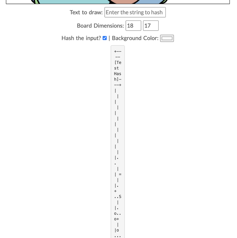
My guess is that this is because you're using 'white-space: pre-wrap' as well as `width: min-content`—meaning that Chrome is wrapping your lines as much as possible to fit them into as small as a width as possible. You can fix this by overriding the default wordpress 'white-space: pre-wrap' styles with 'white-space: pre'.
A shame, because I enjoyed the article! A very interesting look into a part of the OpenSSH code I've always been curious about
I'll take a look at those `pre` elements this weekend. I had no idea they were broken on chrome. In fact... it looks like they're borked on Firefox as well. Thanks for the heads up on how to fix it, Wordpress seems to have been playing around with my formatting recently (probably my poor newbie practices)!
EDIT: That seems to have fixed it. Thanks for flagging it up, please let me know if it's still broken!
If the goal is to make it easy to see if two strings are equal, why not display a cryptographic hash of them instead? There is of course a very small chance of collision, but ignoring that? Does the drunken bishop produce unique images given the dimensions and input sequence length used?
I think the idea is that when a human checks to see if two hashes are equal, they usually just check the first few bytes, and maybe the last few bytes. You could attack this by grinding out hashes to find two with the same first few bytes.
Of course, you could do something similar with this visual algorithm, but I guess the idea is you are using more of the human visual system so it's harder.
> are they the same? Let’s use the random art to find out.
Sometimes hashes are visually similar and people aren't always able to compare so finding a different way to represent them could help ensure accurate comparison.
What would be interesting though is if you simply chunk the hash into smaller pieces would it be easier to compare?
> fc94 b0c1 e5b0 987c 5843 9976 97ee 9fb7
> fc94 b0c1 e5b0 937c 5843 9976 97ee 9fb7
I'm sure it depends a lot on the size. If it's a longer string the grid becomes easier, but for shorter strings the chunks would probably suffice.
This is, effectively, displaying a cryptographic hash. But hashes are long and filled with lots of the same thing, so some software [also] turns them into other things, like "random art" or using a word list to turn a hash into a "sentence".
Doing an extra round of hashing wouldn't hurt though, right?
Either the hashes are very different and you can already tell from them (but the art will also be different) or they are very similar (someone trying to sneak a close-enough hash by you) and then the second round of hashing leads to very different art.
I think that would work well. A high-quality hash is designed such that changing a single input bit will flip approximately half of the output bits. So hashing both values will make it very easy for a human to spot whether the input values were different.
Doing an extra round of hashing wouldn't do anything. If they were different before, now they might be the same. If the hashing algorithm is worth its salt (pun intended) then the original hash will be just as random as the hash of the hash, providing nothing of value.
The problem is that an attacker can churn out public keys until they end up with a hash that's very similar.
Picking a random number and doing a keyed hash of both inputs, then comparing those, would bring out small differences in a way the attacker cannot control.
That does seem like an interesting variation in the way the bishop moves in chess board, is there a chess variant which uses this bishop movement scheme?
You absolutely could do that. I think symmetry often looks nice in these things, so you could start to get a bit creative with the algorithm and decide that the first 2 bits denote symmetry like {0: None, 1: Vertical Mirror, 2: Horizontal Mirror, 3: 4-fold rotational}.
There's a whole tonne of procedural generation tricks you could employ to get interesting aesthetics pretty quickly.