Weelll… that page lists the #ffffff version of the flag of Poland [0]. The law specifies the color using a strange color scale (CIELUV [1]), and it was written in the 1980s with fabric in mind, which cannot be a pure white - so the color translates to #E9E8E7, looking like [2]. This was the subject of a flamewar on Polish Wikipedia around 2006, which also involved a light-pink version [3] due to someone miscalculating the colors. In the end, en.wiki uses the #fff version [4], and pl.wiki uses the grey version in the flag article [5] and the white version anywhere else [6].
And a few months ago, the government proposed an amendment to the law. That lists #ffffff as the official color (for non-textile use). But it will probably take some time until it actually goes into force, if it ever will…
tl;dr: colors are hard, flag colors specified by 1980s laws doubly so.
Whoa, that is indeed a really bad approximation. The site notes that all the flags are forced to 4:3 so many of them need to be retouched (few real sovereign flaga are in this ratio). But that's just really bad approximation - the sun and eagle are way out of proportion.
I noticed also that Bouvet Island (bv) is represented by an almost comically bad version of the Norwegian flag. Finally, many of the colors are off, e.g. flag of Saudi Arabia.
This site is dangerous - by using these ridiculously incorrect flags you actually risk offending certain users.
If you do not know the specific history regarding why the proportions of some national flag are as they are, I would be very careful about altering those. Although probably not criminal in most places, showing an incorrect flag can still cause offense and draw disfavourable attention to the publisher who uses the incorrect flag.
There has been a Supreme Court precedent that lets you to do whatever the fuck you want with a US flag that you own. You can trample on it all day long, and it’s a protected activity under the first amendment.
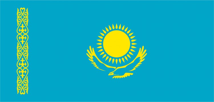
My main issue is wrong ornament and it looks like very quickly put up work, e.g. sun rays are misaligned, eagle's head looks like a child paint. I'm not offended by it, but that's a bad quality and lack of attention to details and for some people that could be a source of offence when it comes to their national symbols. I admit that Kazakhstan's flag is quite complex compared to something like 3 colored rectangles, so it's hard to ask for more. But wikipedia's SVG should just be sourced and resized as necessary IMO rather than spending time re-painting it again. Probably the same with some other countries. I don't want to blame someone who took his time re-drawing those flags, that's respectable by itself. But there's some space for improvement. May be I should make a pull request rather than whining about it.
Most of these flags seem to have wrong proportions, a lot of those I checked also have wrong colors and some of the flags have other serious mistakes. So unfortunately this library seems quite useless.
Only if you're fine with them being indistinguishable.
The flags of Indonesia and Monaco are easy to tell apart if they're the correct aspect ratio, because the flag of Monaco is much narrower. If you force both of them into the same shape, as this collection does
they only differ in the shade of red. And I think they got it wrong: Indonesia's red looks darker than I'm used to, Monaco's looks brighter.
If you absolutely need to fit many different flags into a uniform rectangle, you'd better keep the aspect ratio and leave the rest of the rectangle transparent. And don't forget to include a differently-colored border so people can tell where white stripes end (or whatever your background color is.)
Ha! I'm from there and it's always interesting to see the flag get butchered in a variety of ways across the internet and in real life. The procedure for drawing the flag is outlined in the constitution and there's a popular numberphile video on it (https://www.youtube.com/watch?v=f2Gne3UHKHs).
The 1:1 variants seem to indicate that this collection is intended more for the benefit of UI designers etc. who want all flags to have consistent shape for their designs rather than as a reference for the definitive versions of flags.
Unfortunately they chose 3:4 for the rectangular variants, which isn't really used that much, 2:3 and 1:2 are more common for flags[1], so lots more flags have their designs rearranged, squished and stretched to fit the box than would otherwise need to be. For example flags with the UK's Union Jack in the canton seem to be noticeably mangled as the Union Jack seems far too large relatively. It's always going to be a compromise to have one shape, but just using 2:3 (the most common shape) would mean far fewer would need adjustments.
> The 1:1 variants seem to indicate that this collection is intended more for the benefit of UI designers etc. who want all flags to have consistent shape for their designs rather than as a reference for the definitive versions of flags.
So the UI people just make up fake flags then. Cool.
It depends on calc(), vw and vh units, so it’ll work in browsers but not elsewhere.
(Certainly not all flags with similar specifications will be achievable; this one’s diagonals just happened to be all neatly anchored in the corners, though the red diagonal St Patrick’s cross is fiddly, requiring masking to achieve the required stroke alignment, for which see also https://svgwg.org/specs/strokes/#SpecifyingStrokeAlignment, which is an incomplete draft, and unimplemented.)
A simple "technical" project that solves a clearly defined issue (a collection of the flags of the world for easy use) but turns out to be a lightning rod for political drama.
On my iPhone, some of the cross flags have gaps in them (e.g. Georgia, Guernsey and Sweden), see image below. But when I view the source for the Swedish flag, it's very clearly drawing one blue rectangle and two yellow ones:
I still assume political reasons and it's a lose lose situation for MS. E.g. they either include Taiwan's flag and lose China's approval, or they don't and get a huge backlash from everywhere else.
PS: Firefox on Windows uses its own emoji font "Twemoji Mozilla" to display flags.
No font in Google fonts does, for instance. At least from their own little demonstrator. There is https://github.com/googlefonts/noto-emoji Noto Emoji which can render the flags but you need to build it yourself
Anyone know of a similar library but with low-poly / low-res SVG/PNG flags instead? These flags are great, but they're also huge (some bigger than 400kB), which isn't really necessary if you're only showing them as small icons no larger than 10-20px.
They look terrible (as SVG is not something that is good for aesthetics) and are ironic beccause they insult the nationalism of each country. Well, maybe I'm thinking of coat of arms in SVG.
Sweden 228B, Croatia 41.5kB. And kids in first year of school should know how to draw flag from memory :(. SVG file size should be good indicator to see if flag is to complex.
.svg)
https://commons.wikimedia.org/wiki/Sovereign-state_flags